Tuesday, October 13, 2015

...............................The Fragile Juice Box............................

Isolation
(ELS: The camera is very far away from our subject, and this establishes our scene)
Pondering
(LS: The camera begins to zoom, but
there is still a considerable distance from the subject.)


Uncomfort
(MS: The shot is waist-up, background is visible)


Quick Thinking
(CU: The camera is quite close to the subject,
it shows the expression of the subject clearly)


Rumble
(Torso: The shot only shows the torso of the subject)


A Feel of The Place
(4 Panel Sequence: Showing rhe scene around the room without
using words gives the whole picture a certain mood and feel) 


I C U
(Over-The-Shoulder: This shot shows the perspective
from the shoulder of the subject,
its used to frame the image
 the camera is pointing towards)


 Warm Welcome


(Eye Level: Located at normal eye level of the subject, 
shows the perspective of the subject)


Seething Stare
(ECU: Much closer than a close-up, shows much detail)

This is also a cutaway shot, cutting and alternating from the perspectives of the subjects.


Come And Get It
(HA: Camera is positioned above the subject, looking down,.
It gives the picture a dramatic appeal)


What Are You Waiting For?
(LA: Camera is positioned below the subject, looking up)


Together, We Are One
(Head & Shoulder Shot: Shows the shoulders up to the head)


We are all rosebuds! *rainbow*

     Citizen Kane was a good film. It prodded at our mind through the whole film to get you thinking about what “rosebud” meant. That got me searching for clues and made me pay more attention to the little details in the movie to see if I could figure out what rosebud meant before the movie ended.

    The whole film seemed to be based on light and dark. There were many scenes where the character’s face were only lit by a tiny bit of light or they were completely in the dark, just a mere silhouette. This definitely helps how the mood of the film progresses and switches, it also helps set the scene. When there is darkness and silhouettes there is an ominous tone which the film sort of revolves around. Other than light/dark, there was negative space, shape, and line that helped give the film’s mood.


    It was a good film, I think what the artist was trying to portray worked out fantastically. There were many memorable scenes, and it was very enjoyable. The beginning dragged a little, but it caught my attention in no time at all. It got me thinking about money and how people think they can buy happiness with dollars, it seemed Mr. Kane tried to do this. It also got me thinking about power, dominance, and childhood innocence. What age do we lose our innocence? Do most of us try to hold onto it? When we find out what Rosebud is, it sort of touches on your heart and  gives you sympathy for Kane because most of us have something from our childhood that we will always keep near and dear to us, something that we never want to lose because we never want to lose our innocence. I think that was what the film was all about.

Sunday, October 4, 2015

An Unnecessary Over-Emotional Story Using Elements of Art

Yellow Nostalgia
(In this photograph the yellow is vibrant and 
the pallete is very bright and fluorescent)
Lonely and lost, Taylor remembers her love and how 
they used to pick flowers together in the courtyard.

                Lost & Insecure               
     (Chelsea takes the form of an oval accompanied
     by the shape of the buckets behind her)
Chelsea begins thinking of Taylor, her soulmate,
and suddenly feels lonely and vulnerable without her presence.

Brushed Off

(Chelsea and Taylor are in unison, facing the same direction)
They had gotten in a fight earlier,
which left them both torn and distant.


Too Late To Apologize
(Our eyes fall all over this picture)
Chelsea begged for forgiveness, but Taylor
turned her apology down and demanded for space.


Far Far Away
(Outside being very light, inside being so 
dark Chelsea is just a silhouette)
Chelsea waited for hours for Taylor
 to come running back to her.

    Cold Shoulder
        (Same as above, however Eric is outside and still dark)
Eric has waited so long for this day to come,
for he has been in love with Chelsea for many months. 
                                                           
    Vengeance
   (The three are ordered tallest to shortest)
Eric always watched, so envious of Taylor.

 Open The Doors
(Chelsea is what our eyes fall on first in this photo)
Chelsea walked and walked,
hopelessly searching for Taylor.

      Mirror On The Wall
       (Chelsea and Taylor being the subject
        and negative space surrounding them)
Chelsea is losing her mind without Taylor,
even beginning imagining her beside her.


   Walls Apart
 (You could split this image in half and

    it would be the same on both sides, 
therefore this photo is balanced)
They finally cross paths, and they agree to disagree.


   Reunited
      (The brick wall and Taylor's flannel gives this photo texture)

They come together again, wondering why they ever parted.

Hanging By A Thread
(This photo was taken using the grid of the rule of thirds)
Eric, outraged that they didn't end up breaking apart,
tries to physically tear them apart himself.

       Connected
        (The lockers, the stairs, and the lights all show a different line path)
After a great fight with Eric, he realized they will never ever part.


Tuesday, September 29, 2015

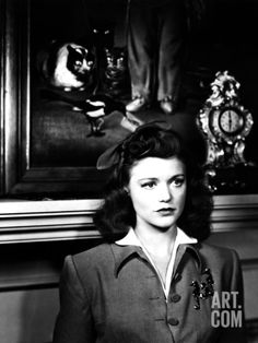
"The Cat People" (surprisingly not about a support group for crazy cat ladies)


    Seeing the title at first, expecting a movie about crazy cat people, I was quite disappointed in this aspect. However, The Cat People wasn't a horrible movie to me, but it wasn't amazing either. This movie was not about crazy cat people, but rather about a young woman who fears her passion will turn her into a cat.

    There were many parts of the film I didn't understand. There were some hints and secrets I hadn’t noticed until told( probably due to the lack of my interest and focus) because it didn’t seem apparent or crystal clear in the film. The violence was all implied in actions and words and it was eerie because it was implied but never acted upon. The film did have a dark tone that you could notice, but something you couldn’t get into detail about unless you really paid attention. The storyline was quite slow, which I understand due to the time period, but it wasn't like "M" either-- it didn't keep my attention regardless of slow pace. I sort of zoned in and out, trying my best to keep up to pace but it just wasn't working for me.

    I did like how they used light and dark in the film, however. They always made Irena this dark slim and sleek figure that is always wearing dark clothing and lurking in the shadows, she even stated that the dark is “friendly”. It added to the whole violence-without-actual-violence thing, and how Irena is sneaky and evil like a cat. I think they were trying to make a comparison about satan as well, I didn't quite get that message though.

    Overall, I don’t know if I would recommend this movie to my peers, but I would watch it again myself to get a better idea of the art of it and the understanding.

Monday, September 28, 2015

"M" Review


     This film overall was very eerie and strange. All the way from the still shots of empty tables, empty air, and emptiness in general, to the awkward look of the actors. There was plenty of silence, which added to the creepiness, and when it wasn’t silent they chose unnerving sounds such as whistling and off-putting day-to-day noises. I was actually very interested by this movie because I had not seen many older films previously, so it interested me quite a bit. I kept an open mind during the whole film because I did not know what to expect.


    There was always a center of interest it seemed in this film, in every shot there was always something that they wanted you to pay attention to right as the scene changed. The way he moves his camera through windows, and to capture silhouettes is an incredible way to show eeriness. There was lots of framing, keeping the focus inside a frame, which gave a sinister feel as well. (Example: High angle shots showing power and low angle shots showing the opposite.) The shots and angles all came together to bring this movie its character. The camera shots added to the dark plot and made everything a lot more ominous.


    I think the artist is possibly trying to portray the Germans and how their mindset was in the time of war. Through the audience at the end, and the panic of the people and how they deal with the situation, it is relatively clear. When a town or group of people live in a state of panic/fear, order and chaos begins, until a higher power can bring order. I think that is the connection they’re trying to make in the movie. The mood of this piece is dark. There are many factors that show this such as : the camera angles, camera shots, shadows, emptiness, silence, and the acting. I think the author of this piece was very successful in conveying their message.


    I enjoyed this film. Although it was relatively slow, I stayed open and focused on taking in all the aspects of it. It put me on edge, which I believe was what the author intended to happen. It got me thinking and making connections to that time period. I hadn't seen many films previously from this decade, so I was very pleasantly surprised. The shots captured my interest, I thought they were very appealing and pleasant to watch, even though the storyline was slow. There were still many things to look at and analyze in those areas that dragged, which is what kept you interested. All in all, I thought it was a good film.